
The Client
IRServices
How do you know when it's time to evolve your brand?
IR is a leading global provider of proactive performance management software for critical IT infrastructure, payments and communications ecosystems. Some of the world’s largest companies rely on IR to provide business critical insights and ensure continuity of critical systems across the globe.
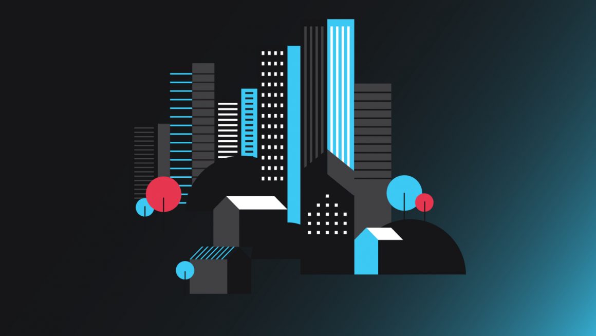
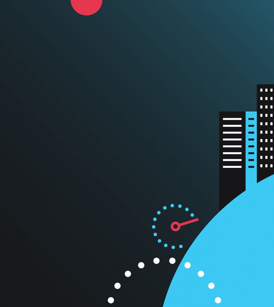
In 2015, IR released a new brand identity illustrated with dots and dashes. Over time, the simple but abstract idea of using these shapes to help tell their brand stories became too constrained for IR. So they came to us to help evolve the brand, and bring greater versatility to their recognisable dots and dashes visual language.
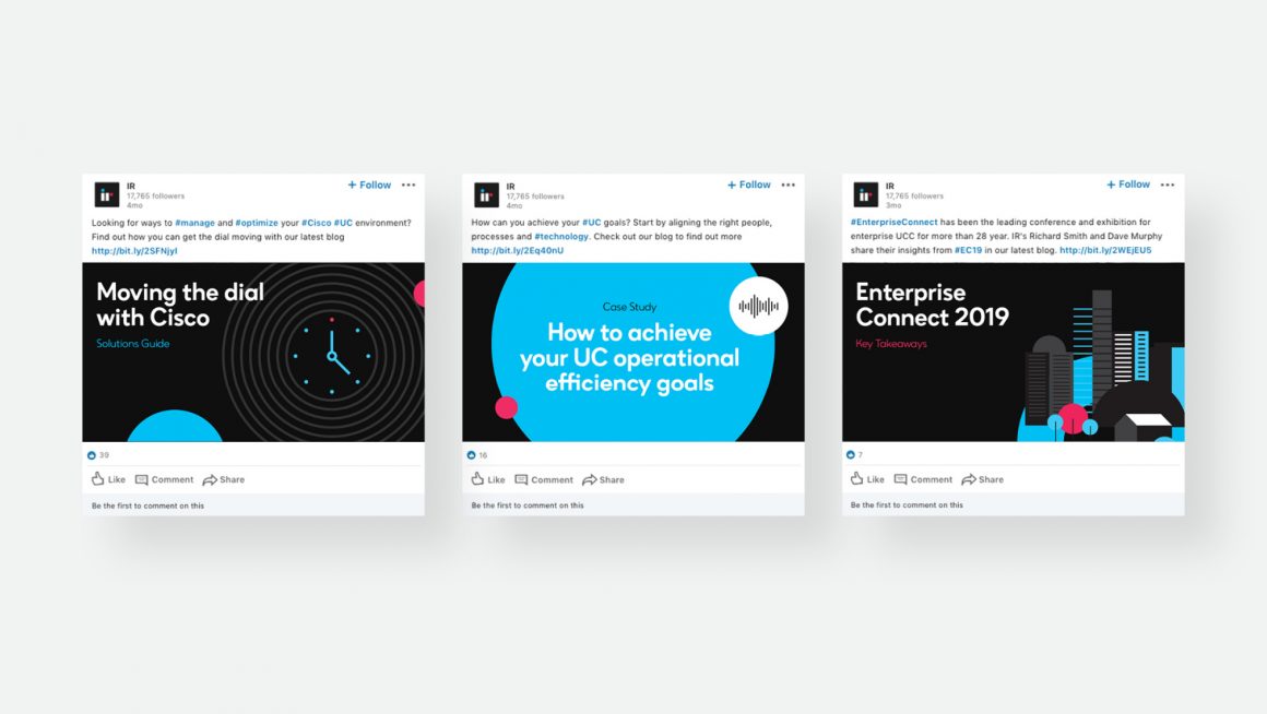
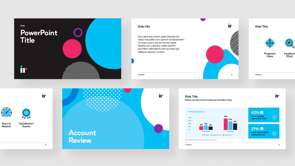
Working collaboratively with IR, we did a brand audit on their internal and external communications – comparing their early brand iterations with the latest version, to get a clear picture of what brand assets remained consistent, and what had changed over time. We also looked at how the brand translated across digital and print mediums. This helped us to understand what elements worked, and what needed to evolve.
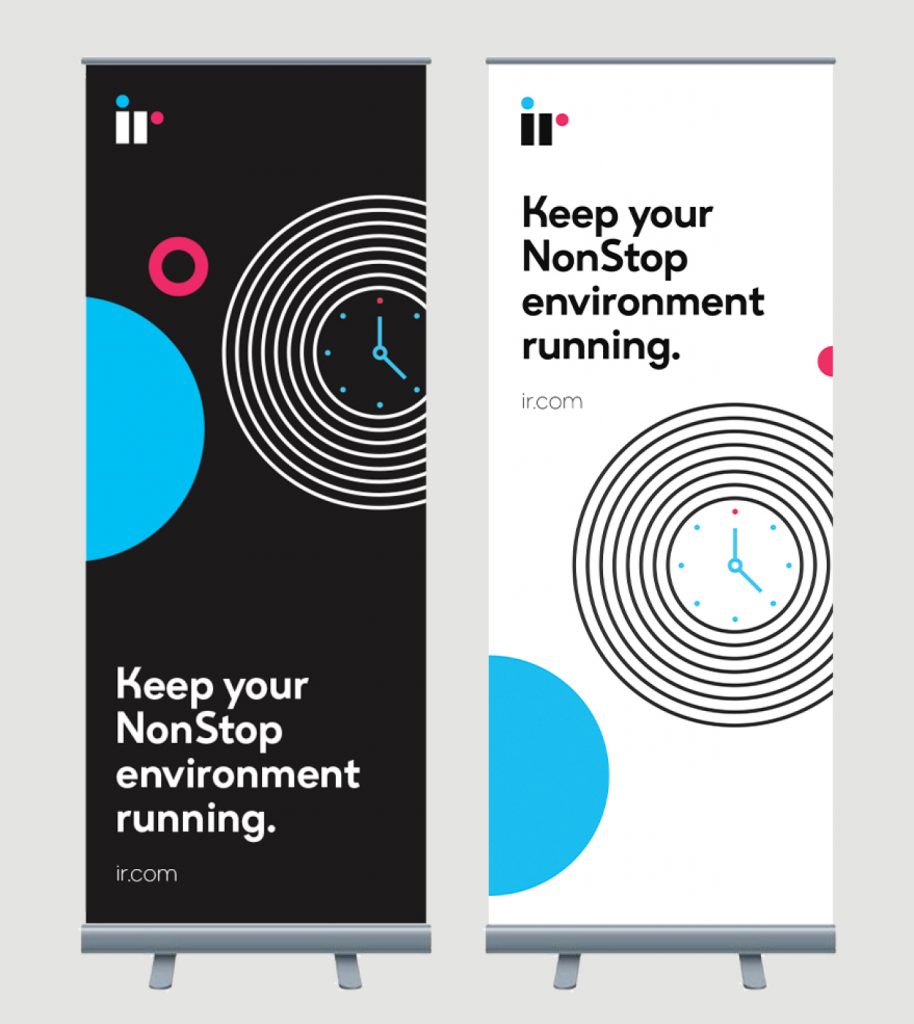
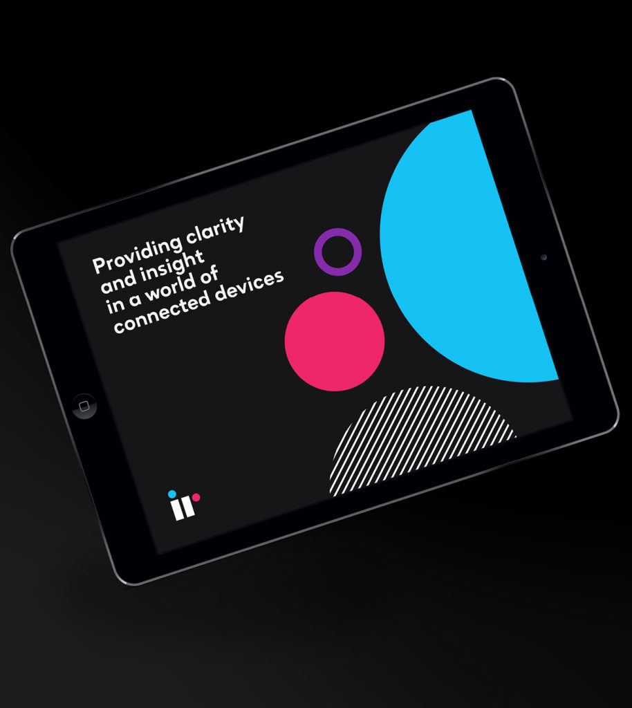
Looking back at the swiss-style of design that shaped their original brand direction, we expanded on the strengths of the previous assets – transforming short dashes into continuous lines, giving dots a new purpose, and including more geometric shapes.
By redefining the use of their core illustrations, grid layout, colour palette, and creating new meaningful assets, IR's brand evolution gave them greater flexibility, and less constraint.