The Client
IronbarkServices
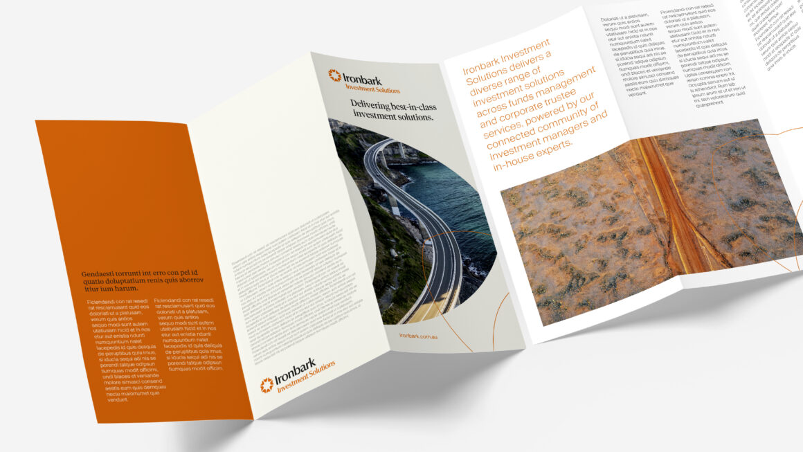
The Ironbark team came to us to evolve an existing masterbrand following the acquisition of several specialist businesses. The challenge was to create a cohesive brand architecture that unified these businesses under the Ironbark name, while still respecting the heritage, expertise, and reputation each company had built prior to acquisition.
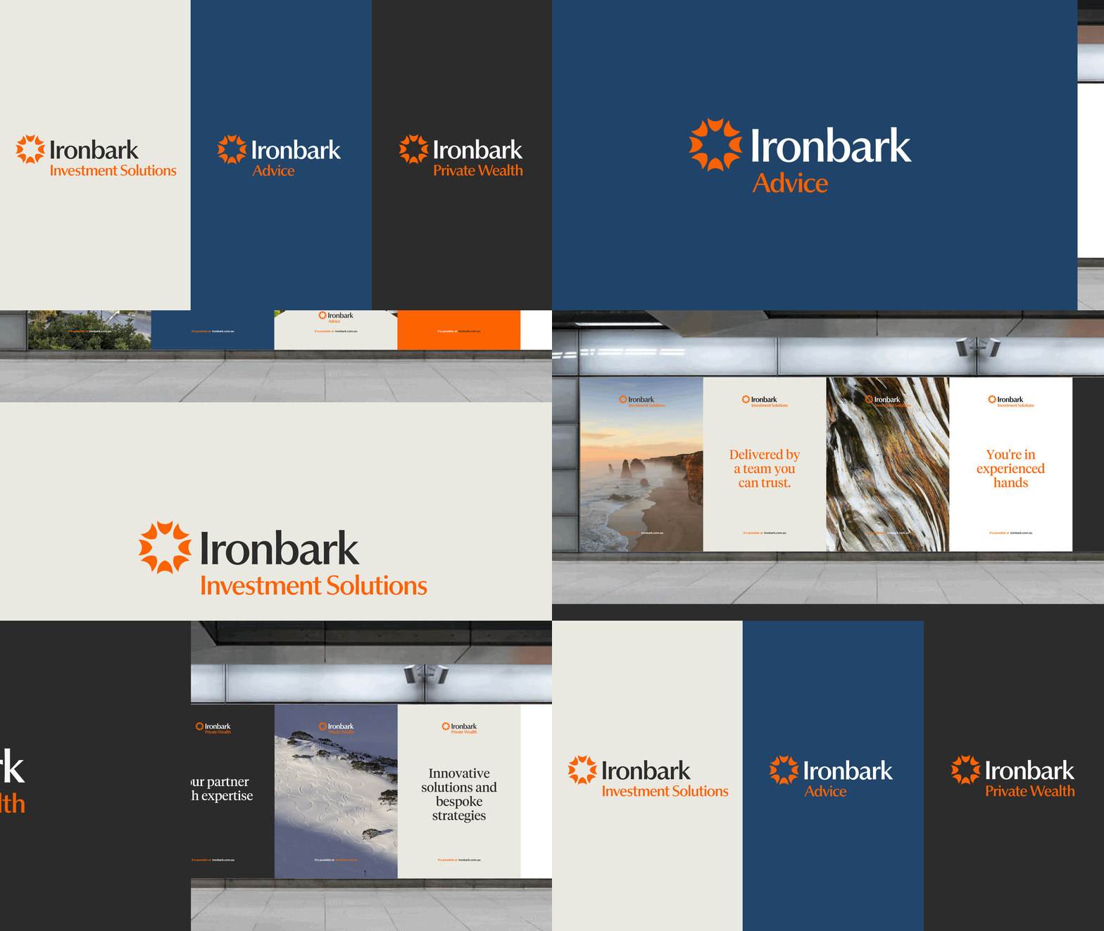
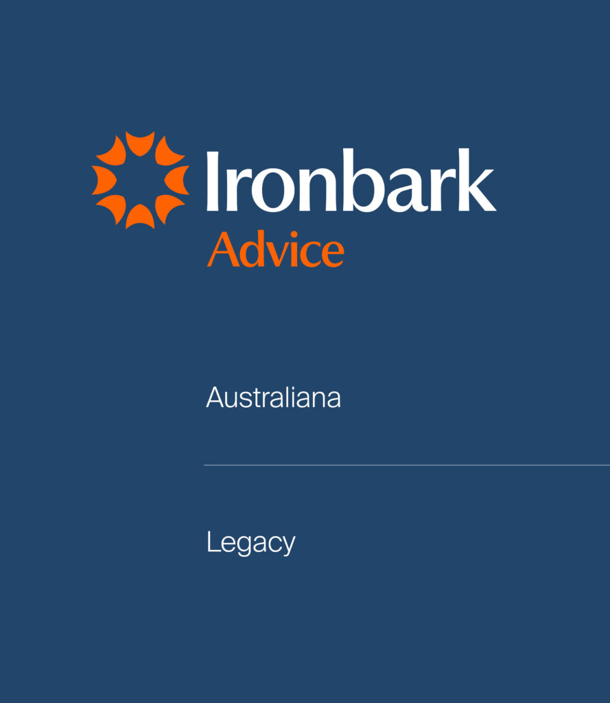
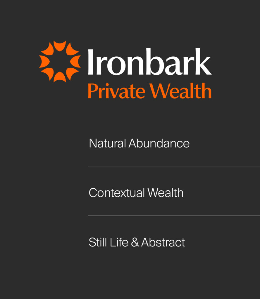
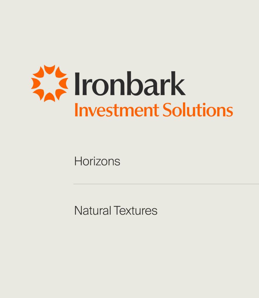
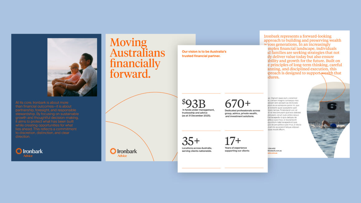
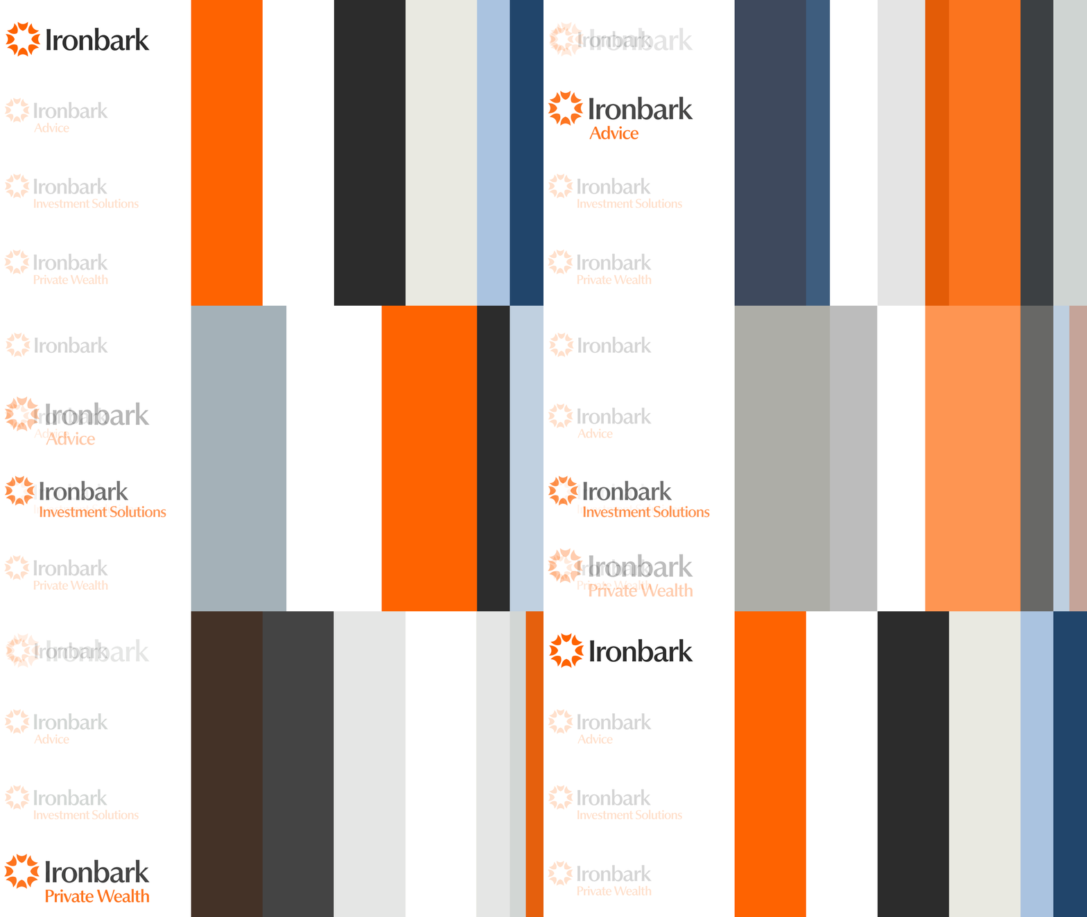
Sitting beneath the Ironbark masterbrand are Advice, Private Wealth, and Investment Solutions, each representing a distinct area of specialty within the broader business. Our approach was to create a branded house that felt connected and consistent, while allowing each division to retain its own sense of purpose and expertise.
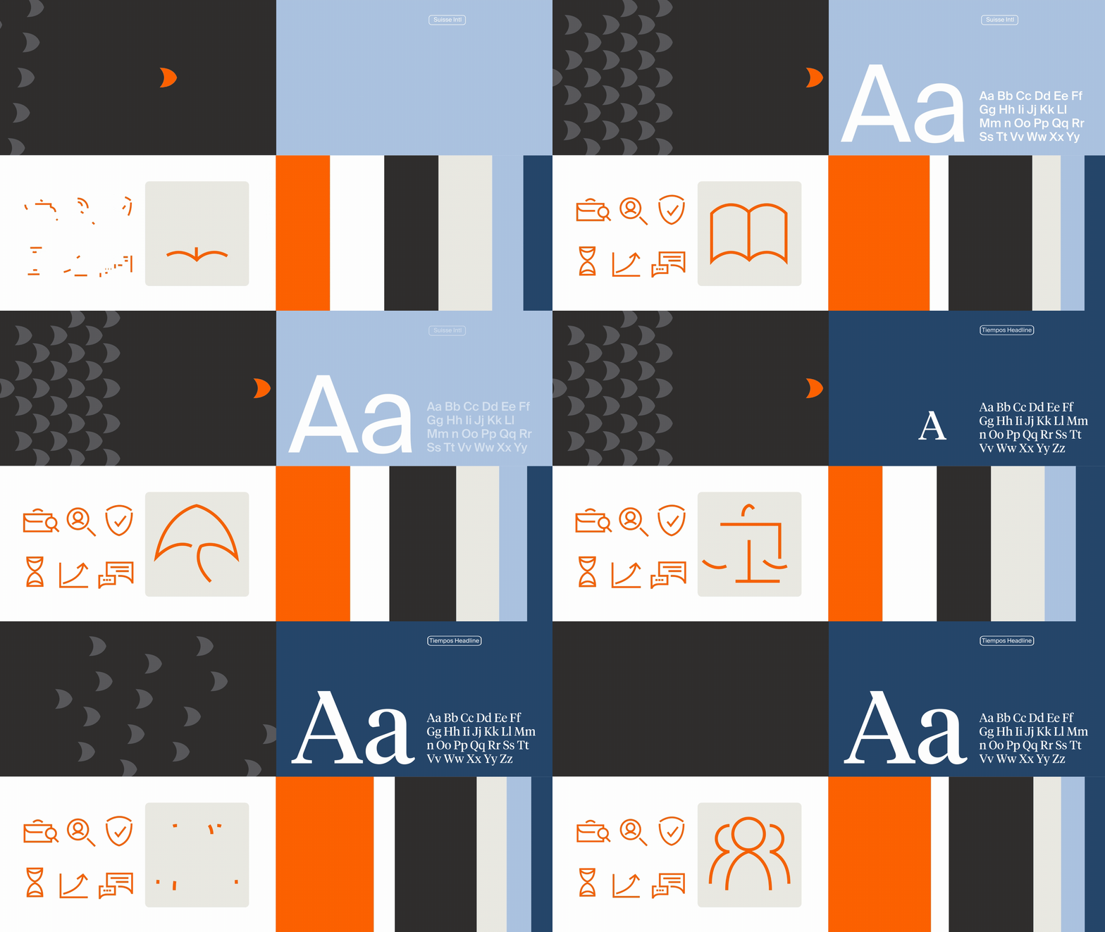
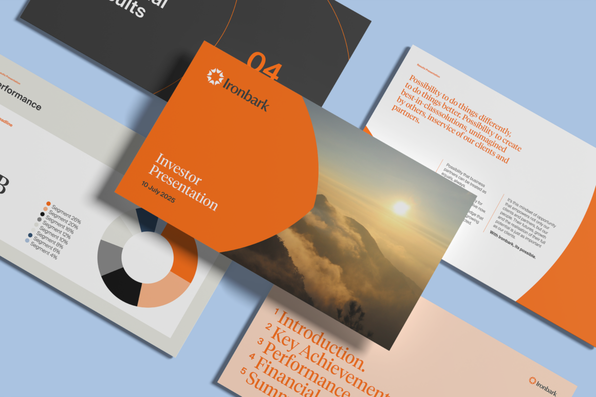
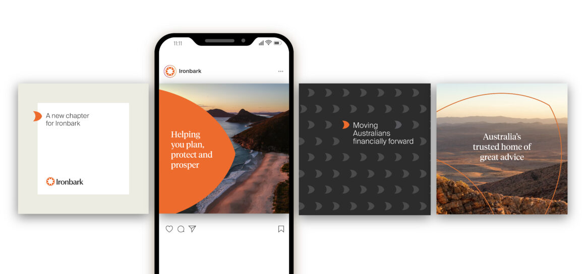
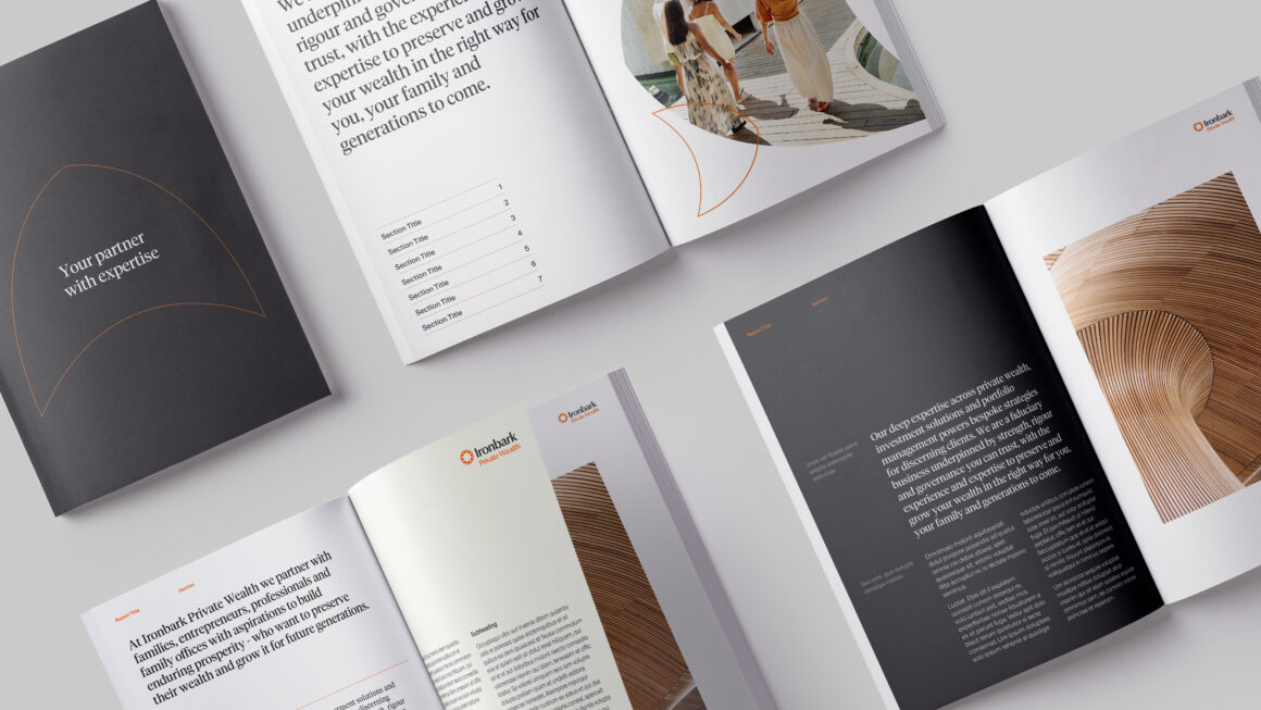
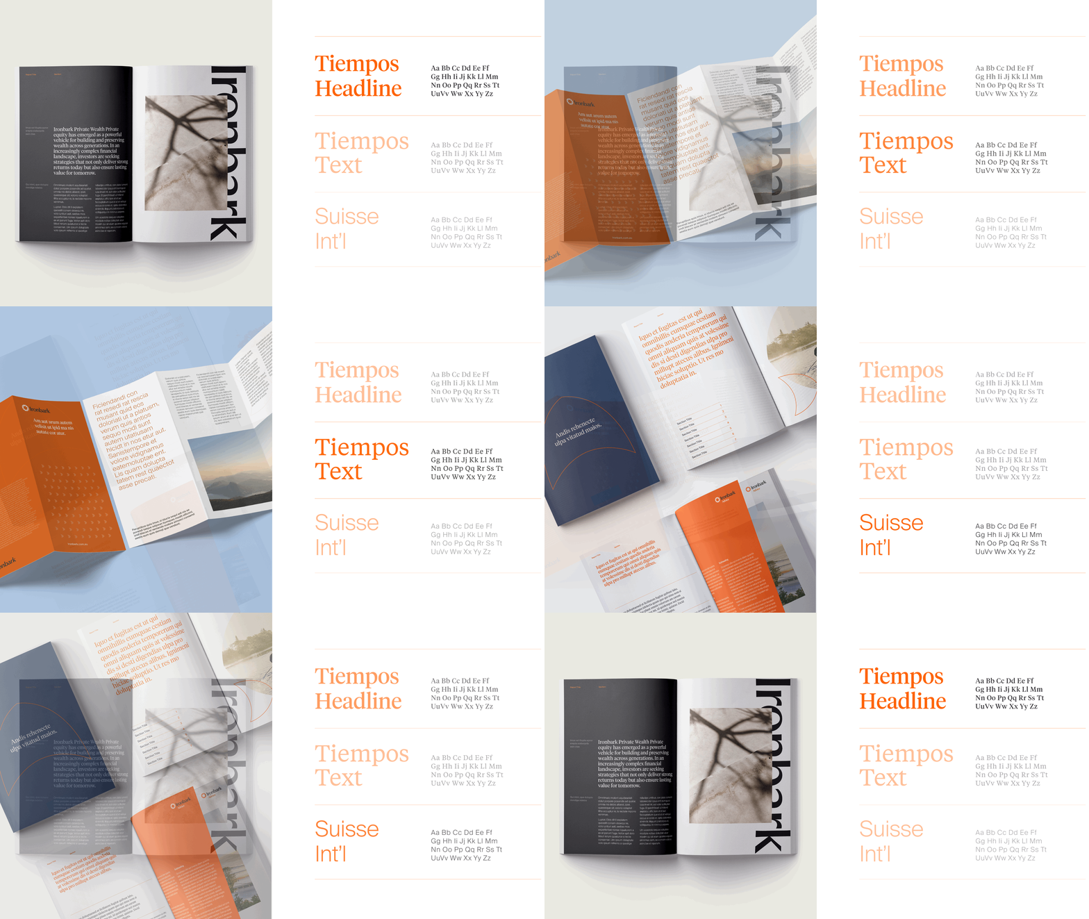
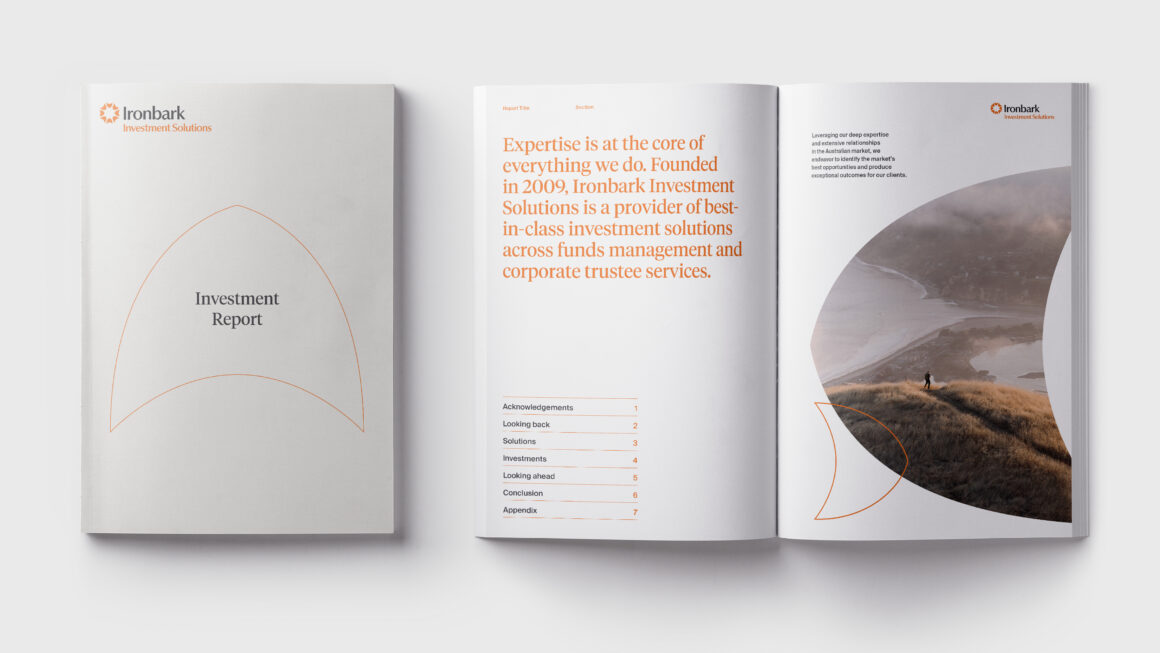
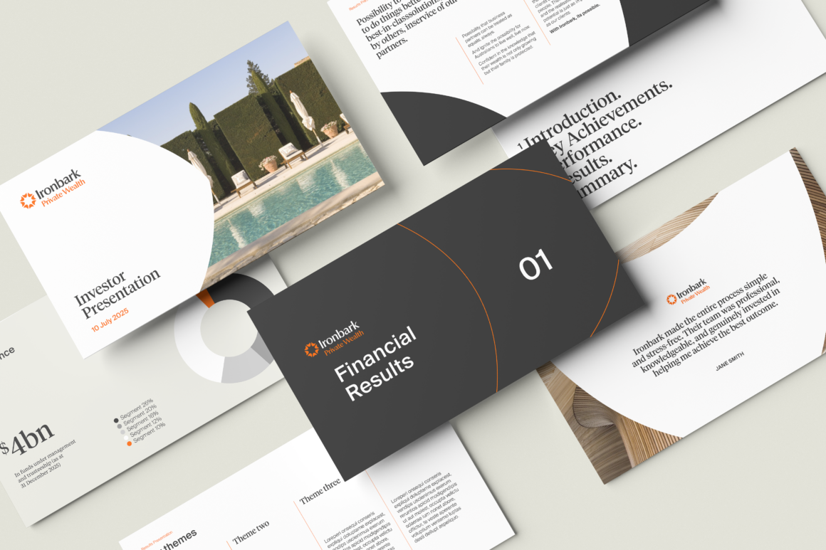
At the centre of the identity is a robust design system that defines the visual language of Ironbark. From colour and typography through to motion, layout, and form, every element was designed to work together seamlessly to create a brand that feels confident, sophisticated, and recognisable across every touchpoint.
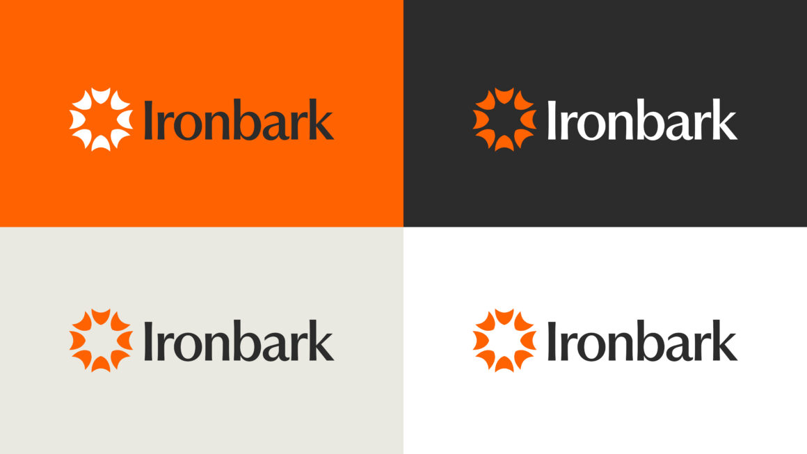
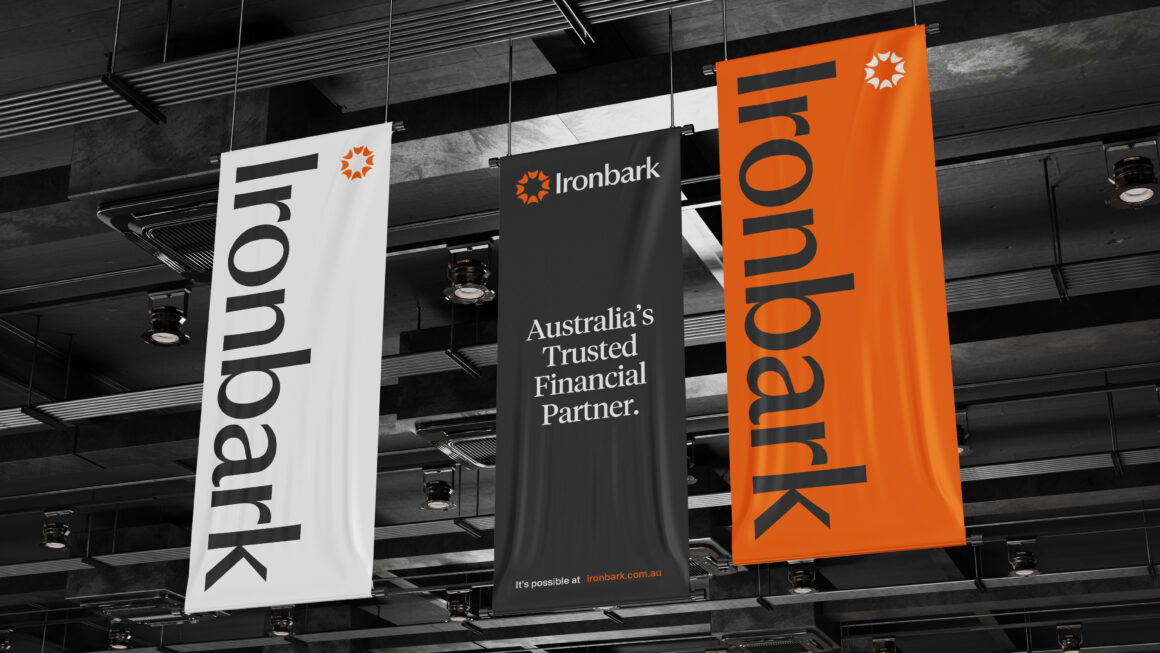
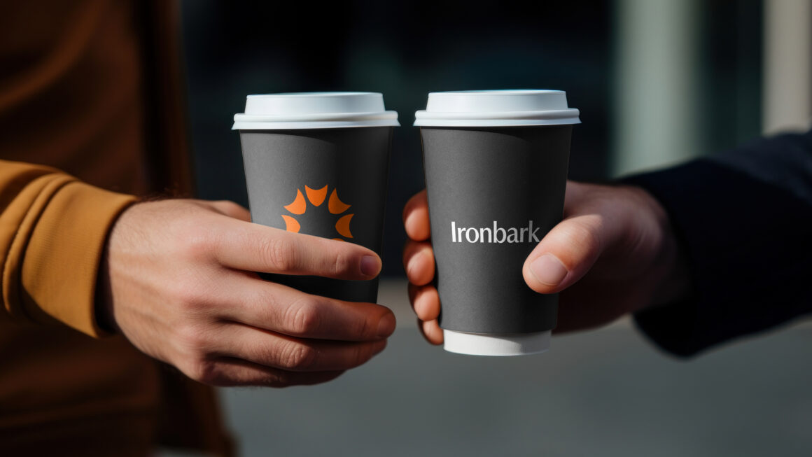
The Ironbark logo is the cornerstone of the identity. Its eight directional brandmark symbolises the many pathways of a financial journey, each moving forward and converging on progress. The mark represents guidance, momentum, and the collective strength of multiple specialist businesses coming together under one unified vision.
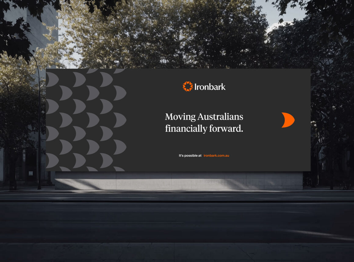
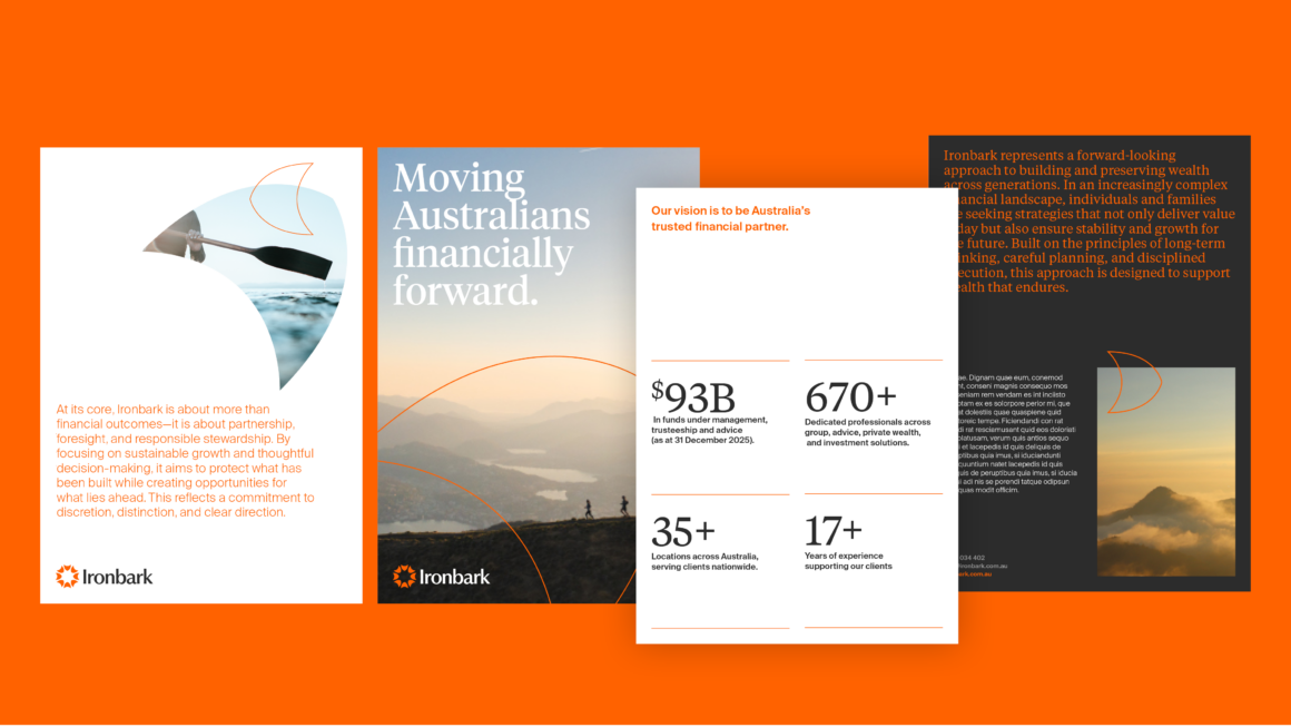
Supporting the identity is the Ironbark Graphic Device, a distinctive and flexible visual element derived from the brandmark and inspired by the form of the Ironbark flower. Interpreted as either a petal or an abstract geometric shape, the device adds movement, flexibility, and visual depth to the system, enabling dynamic application across print, digital, and environmental brand expressions.
Together, these elements create a brand identity that balances heritage with evolution, a unified system designed to strengthen recognition, build trust, and position Ironbark as a confident and future focused masterbrand.